عربي
عربي

 English
 عربي
عربي


sara pop fit
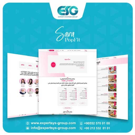
Visual identity design is one of the most important elements for emerging companies and organizations, as it reflects the institution, its activities, and its future vision. Identity is considered the birth certificate of the company, product, or idea in the surrounding environment. Therefore, we opted for the pink color to symbolize femininity and beauty, with subtle connotations of fitness and a healthy body.
Graphic Design
About the project
Visual identity design is one of the most important elements for emerging companies and organizations, as it reflects the institution, its activities, and its future vision. Identity is considered the birth certificate of the company, product, or idea in the surrounding environment. Therefore, we opted for the pink color to symbolize femininity and beauty, with subtle connotations of fitness and a healthy body.
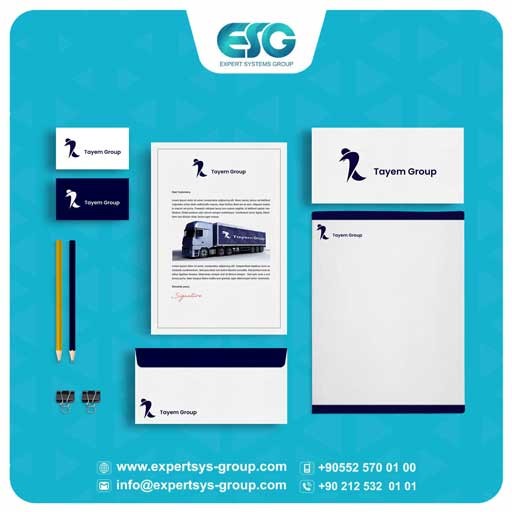
The following was designed for Sara Pop Fit, which operates in the field of fitness and physical health:
1. Logo.
2. Business card.
3. Company facade.
4. Cups.
5. Papers.
6. Envelopes.
7. Notebooks
Client
sara pop f...
Project area
sara pop f...
Service
Graphic Design
Demo links
Our Projects
Discover more

















Our products
Discover more

.webp)